Interaction design, UX research
I was hired as an interaction design intern and later a user researcher for iQiYi international products. I was responsible for the interaction design of the video streaming apps on iOS, Android, as well as the website for desktop users. I gathered voice from users and gave opinions as their advocate on the product level.
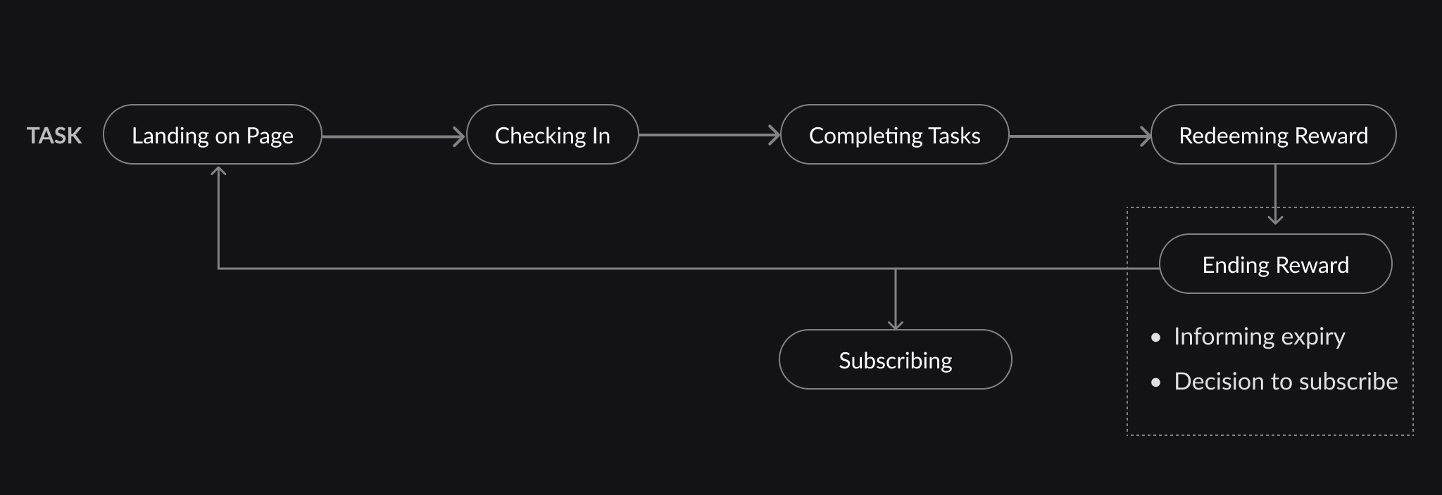
For one of the requirements, I designed the reward center for users to exchange in-app activities for rewards.
iQiYi international department
40 hr/week
Apr 2021 - Apr 2022
Interaction designer
(Apr 2021 - Apr 2022)
UX researcher
(Sep 2021 - Jan 2022)
Wireframing, Prototyping, AB Test;
Survey, Interview, Focus Group

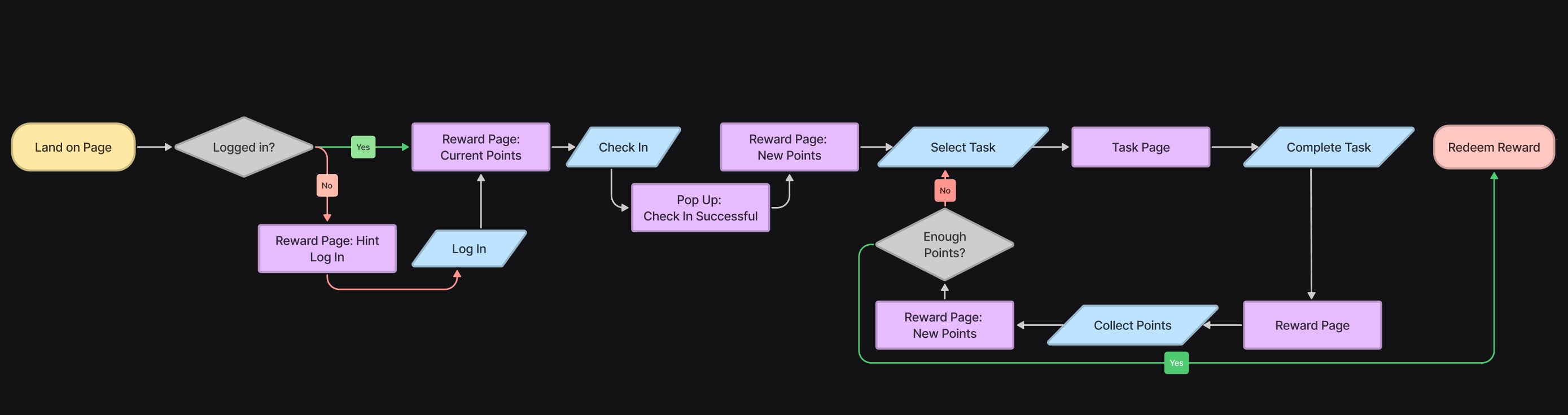
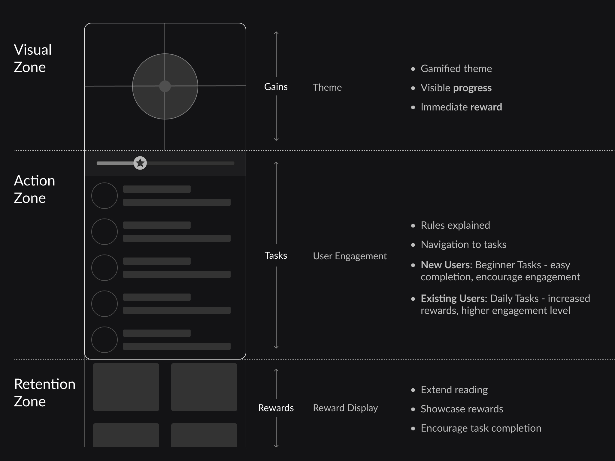
On top of the screen, I use the membership theme color (gold) to create a distinguished vibe for the reward centre. Next, a stamp card of the check in progress makes an intuitive visual aid.
The next section includes three groups of tasks:
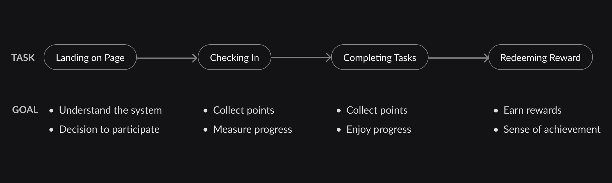
Beginner tasks include simple steps (such as building a user profile) so that new users get familiar with the system and build more connections with the app. To get them started, a special reward is available once they complete the beginner set. The progress is visualized on top of the task list. From the task list, by tapping on one of them, users are guided to complete each task and gather points.
Daily tasks are for long term users to form the habit and remain active on the app, including sharing and watching videos. The tasks requires a higher engagement level, thus higher rewards.
Finally, the exclusive or limited time category is a placeholder and shows up when there are marketing campaigns.
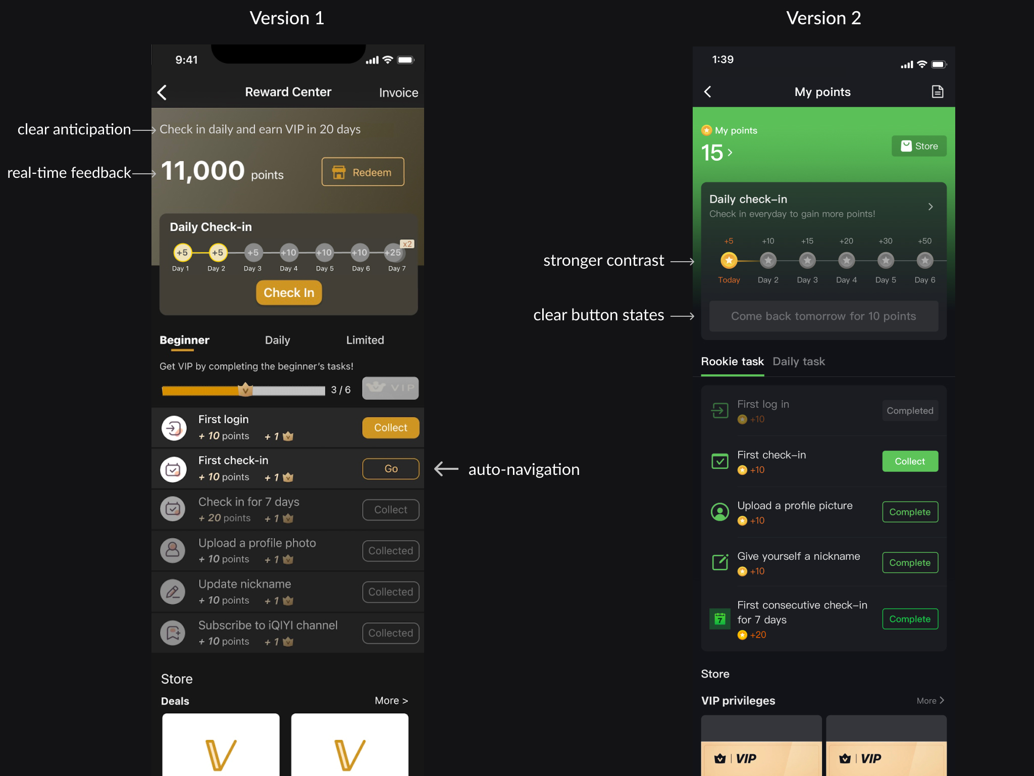
In lean evaluations of the first draft, participants showed a good understanding of the interface and information hierarchy.
However, they found the reward progress for beginner tasks confusing and could not distinguish it from the reward points. To keep the visual consistency, we decided to simplify and take out the beginner reward.
In the final version, the iQiYi brand color is used for the background to highlight the coins in VIP theme color. The text is more centered around the check-in card.
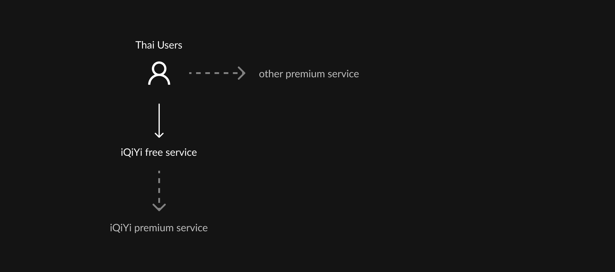
So far, users in 6 Asian countries have tried the reward center. 70% of users visit the page again in the next day, meaning they recognize the function and are attracted by the benefits.
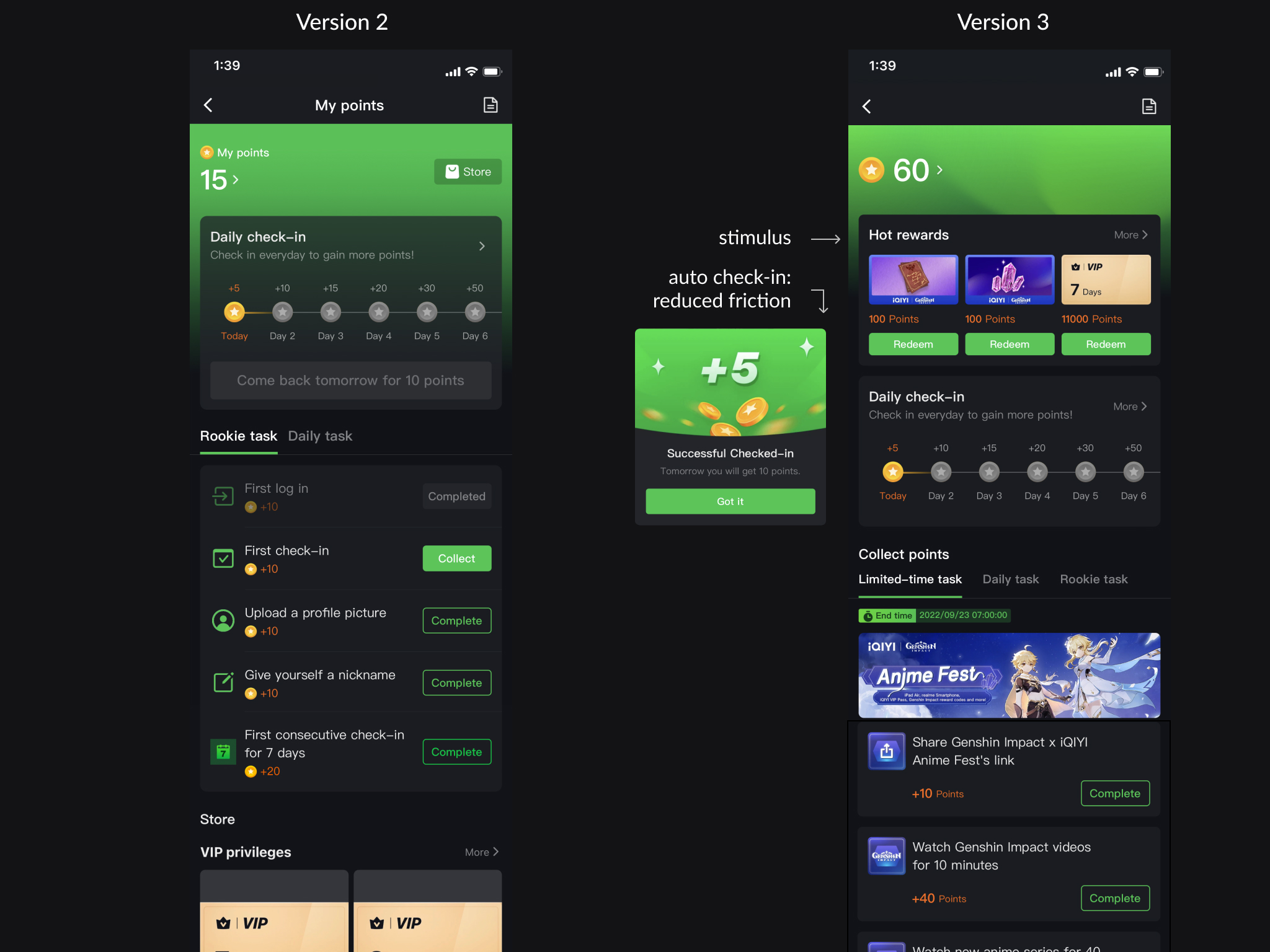
90% of users use the check-in function, indicating the friction between landing on the page and completing the check in. Therefore in the next version update, we changed the interaction from manual to auto check in.
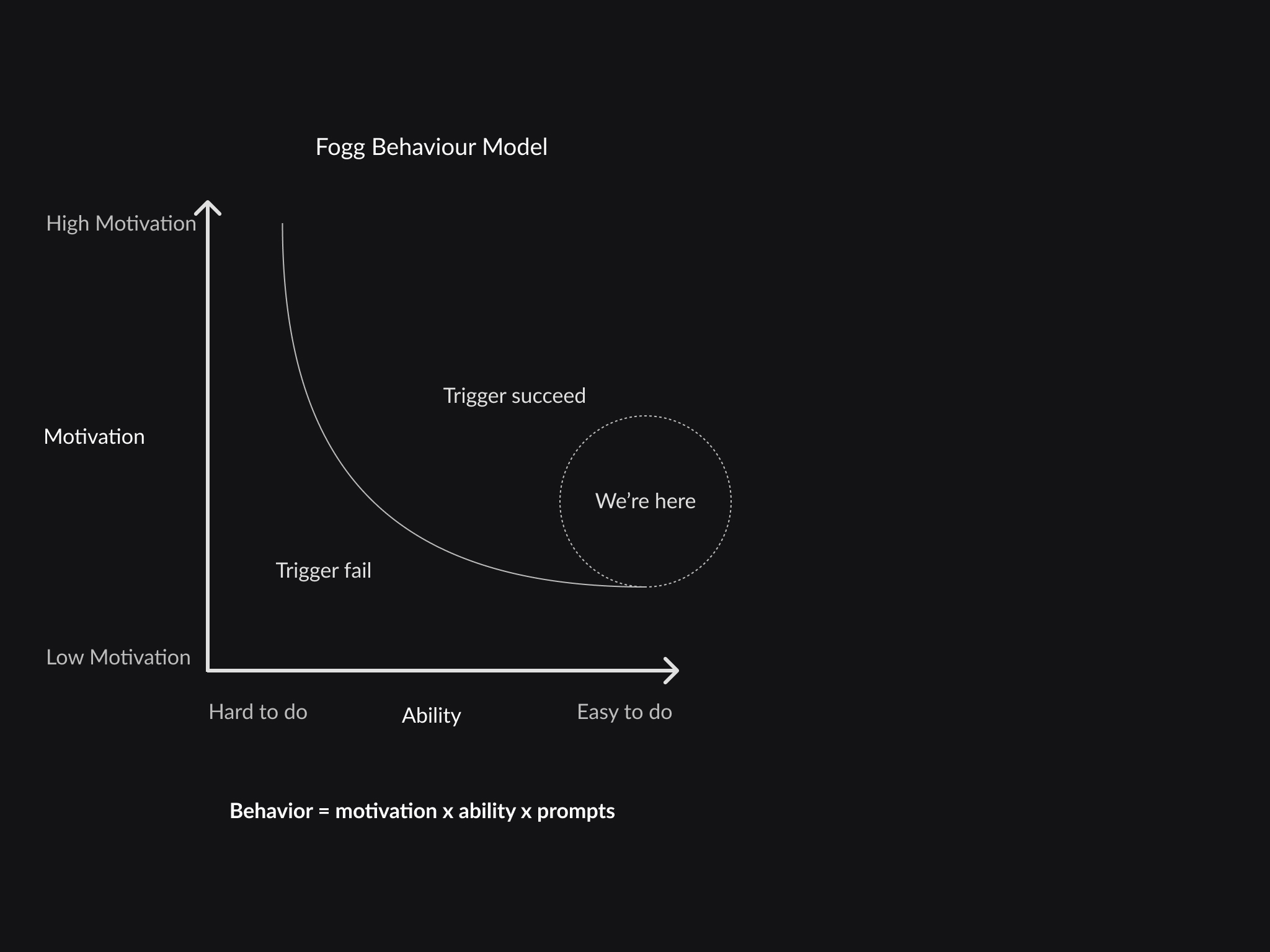
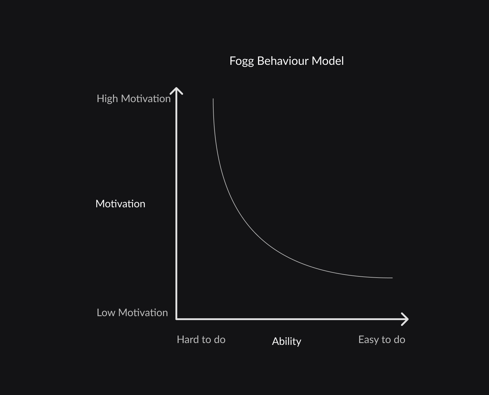
According to the Fogg model, the three components making a behavior are motivation, ability, and prompts.
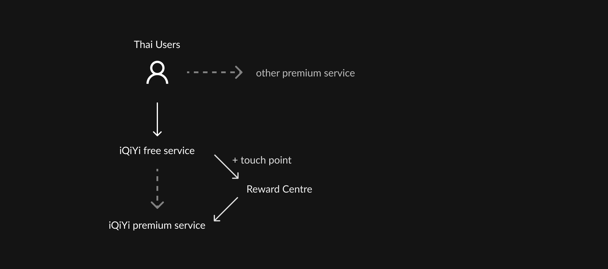
Placed under the "Me" tab, the reward centre naturally has a low exposure. Even though the tasks are simple and users are motivated to use it, we are still missing a trigger for them to visit the reward centre.
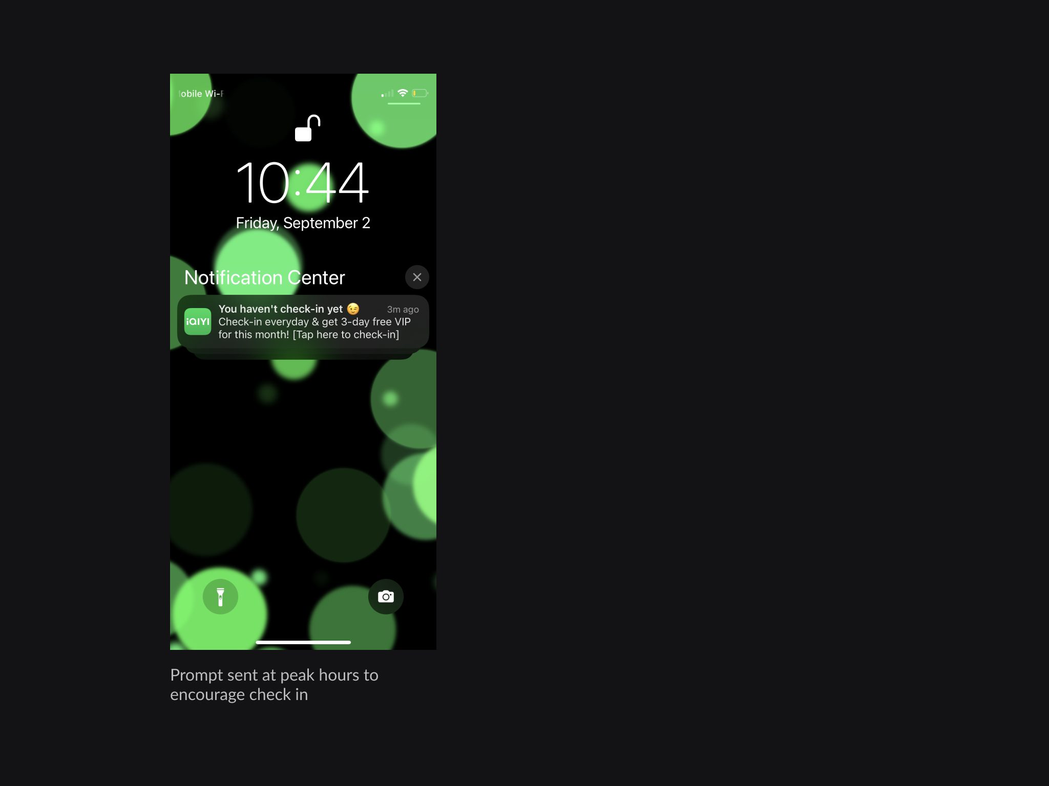
To inform more users and prompt them to participate, we started adding touchpoints, for example, cueing for task completion at peak hours, or adding a toast that shows the change of reward points when users unintentionally complete a task, so that users are informed about the reward system without being cut off from their flow.
Everyday, 1.4% users who visited the page redeemed a reward. It validates that the check-in function is intuitive, the tasks are accessible. The completion rate of daily tasks are between 18% and 29%. While we could not trace the viewing time of individual users, we know the reward center is motivating 1/5 of the user population to earn benefits from watching.

Interestingly, the penetration rate varies by region: the highest being 15% in Taiwan and the lowest 1.7% in Philippine. It is possibly associated with the labelling of the entrance button. More research such as concept testing is needed among the local users to ensure the translations fit their mental model. Usability test is also needed among local users to further improve the experience.
It is also important to stimulate users to make a purchase. For example, cueing for subscription when the rewarded premium trial expires. It will likely increase the subscription rate if the experience was good.